Kirby Meme
So, Jon's tagged me for a meme about my favorite Jack Kirby design.
It probably won't surprise any long-time readers of my blog to know that my all-time favorite character design (as well as my all-time least) are both from the pages of Simon and Kirby's Sandman.
My least favorite naturally is the revisioning of the Sandman. Wesley Dodds's suit and gas-mask combination was an incredibly classy and nifty looking costume. It's smart, sophisticated and just darn cool. So I never understood why the Simon and Kirby run changed it and went with this:
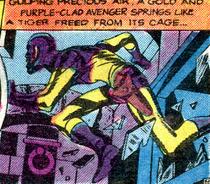
It's a monstrosity. The only person who can get away with that sort of head-cowl and not look incredibly stupid is Captain America. And part of that is because deep-down I suspect Steve Rogers is supposed to be a giant dork. The color scheme is horrendous too. Gold and purple? Egads. And the abrupt transition from purple to gold on the arms and chest? It's completely illogical! Why would anyone have that sewn?
However, oddly enough, as dumb as the Sandman looks, I've always really liked the design of his sidekick, Sandy the Golden Boy:
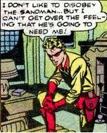
It's a very cute design, much more fitting for a child sidekick than an adult man. Gold and red somehow avoid being the eyesore that gold and purple are, possibly because there's a lot less of the red than Wes's purple. The parts of the costume that are red make sense: the collar, mask, shorts and boots. There's no weird ribcage transition here. Not to mention the simple mask is much better than a cowl.
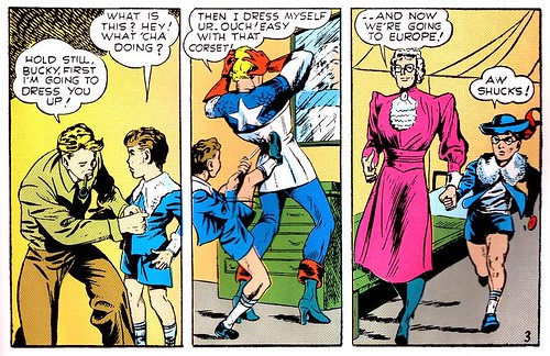
Sandy's costume falls more onto the Bucky end of the scale than the Robin end as sidekicks go. It's actually about as tasteful a costume design as you can get in Golden Age comics. The top has elements of a loose polo shirt, which manages to be both a little preppy and still quite modest. Kids probably shouldn't be in skin-tight clothes and the shirt manages to avoid that nicely. The shorts are nice too. It's hard to tell from the particular panel, but the bottoms of the costume are distinctly short-like as opposed to Robin's panties. They actually cover some thigh! The gold tights, while skin-tight, manage to not be quite so...unclad as Robin.
The combination manages to be cute, distinctly dated (in a good way, given that the character's kept his 1940s roots), evocative, suitably childish and even practical...or as practical as these costumes get at least! :-)
It probably won't surprise any long-time readers of my blog to know that my all-time favorite character design (as well as my all-time least) are both from the pages of Simon and Kirby's Sandman.
My least favorite naturally is the revisioning of the Sandman. Wesley Dodds's suit and gas-mask combination was an incredibly classy and nifty looking costume. It's smart, sophisticated and just darn cool. So I never understood why the Simon and Kirby run changed it and went with this:
It's a monstrosity. The only person who can get away with that sort of head-cowl and not look incredibly stupid is Captain America. And part of that is because deep-down I suspect Steve Rogers is supposed to be a giant dork. The color scheme is horrendous too. Gold and purple? Egads. And the abrupt transition from purple to gold on the arms and chest? It's completely illogical! Why would anyone have that sewn?
However, oddly enough, as dumb as the Sandman looks, I've always really liked the design of his sidekick, Sandy the Golden Boy:
It's a very cute design, much more fitting for a child sidekick than an adult man. Gold and red somehow avoid being the eyesore that gold and purple are, possibly because there's a lot less of the red than Wes's purple. The parts of the costume that are red make sense: the collar, mask, shorts and boots. There's no weird ribcage transition here. Not to mention the simple mask is much better than a cowl.
Sandy's costume falls more onto the Bucky end of the scale than the Robin end as sidekicks go. It's actually about as tasteful a costume design as you can get in Golden Age comics. The top has elements of a loose polo shirt, which manages to be both a little preppy and still quite modest. Kids probably shouldn't be in skin-tight clothes and the shirt manages to avoid that nicely. The shorts are nice too. It's hard to tell from the particular panel, but the bottoms of the costume are distinctly short-like as opposed to Robin's panties. They actually cover some thigh! The gold tights, while skin-tight, manage to not be quite so...unclad as Robin.
The combination manages to be cute, distinctly dated (in a good way, given that the character's kept his 1940s roots), evocative, suitably childish and even practical...or as practical as these costumes get at least! :-)
Labels: golden age, picture post, sanderson hawkins, sandman (wes dodds)
posted by kalinara @ 7:15 AM
9 comments
![]()