Kirby Meme
So, Jon's tagged me for a meme about my favorite Jack Kirby design.
It probably won't surprise any long-time readers of my blog to know that my all-time favorite character design (as well as my all-time least) are both from the pages of Simon and Kirby's Sandman.
My least favorite naturally is the revisioning of the Sandman. Wesley Dodds's suit and gas-mask combination was an incredibly classy and nifty looking costume. It's smart, sophisticated and just darn cool. So I never understood why the Simon and Kirby run changed it and went with this:
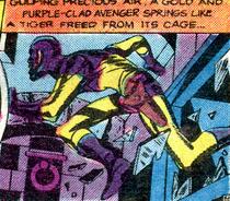
It's a monstrosity. The only person who can get away with that sort of head-cowl and not look incredibly stupid is Captain America. And part of that is because deep-down I suspect Steve Rogers is supposed to be a giant dork. The color scheme is horrendous too. Gold and purple? Egads. And the abrupt transition from purple to gold on the arms and chest? It's completely illogical! Why would anyone have that sewn?
However, oddly enough, as dumb as the Sandman looks, I've always really liked the design of his sidekick, Sandy the Golden Boy:
It's a very cute design, much more fitting for a child sidekick than an adult man. Gold and red somehow avoid being the eyesore that gold and purple are, possibly because there's a lot less of the red than Wes's purple. The parts of the costume that are red make sense: the collar, mask, shorts and boots. There's no weird ribcage transition here. Not to mention the simple mask is much better than a cowl.
Sandy's costume falls more onto the Bucky end of the scale than the Robin end as sidekicks go. It's actually about as tasteful a costume design as you can get in Golden Age comics. The top has elements of a loose polo shirt, which manages to be both a little preppy and still quite modest. Kids probably shouldn't be in skin-tight clothes and the shirt manages to avoid that nicely. The shorts are nice too. It's hard to tell from the particular panel, but the bottoms of the costume are distinctly short-like as opposed to Robin's panties. They actually cover some thigh! The gold tights, while skin-tight, manage to not be quite so...unclad as Robin.
The combination manages to be cute, distinctly dated (in a good way, given that the character's kept his 1940s roots), evocative, suitably childish and even practical...or as practical as these costumes get at least! :-)
It probably won't surprise any long-time readers of my blog to know that my all-time favorite character design (as well as my all-time least) are both from the pages of Simon and Kirby's Sandman.
My least favorite naturally is the revisioning of the Sandman. Wesley Dodds's suit and gas-mask combination was an incredibly classy and nifty looking costume. It's smart, sophisticated and just darn cool. So I never understood why the Simon and Kirby run changed it and went with this:
It's a monstrosity. The only person who can get away with that sort of head-cowl and not look incredibly stupid is Captain America. And part of that is because deep-down I suspect Steve Rogers is supposed to be a giant dork. The color scheme is horrendous too. Gold and purple? Egads. And the abrupt transition from purple to gold on the arms and chest? It's completely illogical! Why would anyone have that sewn?
However, oddly enough, as dumb as the Sandman looks, I've always really liked the design of his sidekick, Sandy the Golden Boy:
It's a very cute design, much more fitting for a child sidekick than an adult man. Gold and red somehow avoid being the eyesore that gold and purple are, possibly because there's a lot less of the red than Wes's purple. The parts of the costume that are red make sense: the collar, mask, shorts and boots. There's no weird ribcage transition here. Not to mention the simple mask is much better than a cowl.
Sandy's costume falls more onto the Bucky end of the scale than the Robin end as sidekicks go. It's actually about as tasteful a costume design as you can get in Golden Age comics. The top has elements of a loose polo shirt, which manages to be both a little preppy and still quite modest. Kids probably shouldn't be in skin-tight clothes and the shirt manages to avoid that nicely. The shorts are nice too. It's hard to tell from the particular panel, but the bottoms of the costume are distinctly short-like as opposed to Robin's panties. They actually cover some thigh! The gold tights, while skin-tight, manage to not be quite so...unclad as Robin.
The combination manages to be cute, distinctly dated (in a good way, given that the character's kept his 1940s roots), evocative, suitably childish and even practical...or as practical as these costumes get at least! :-)
Labels: golden age, picture post, sanderson hawkins, sandman (wes dodds)
posted by kalinara @ 7:15 AM
![]()

9 Comments:
At November 25, 2006 8:11 AM, Anonymous said…
So,what was the reason,I wonder,for The Marvel Comics Purple-N-Green Motif....
At November 25, 2006 11:35 AM, Diamondrock said…
There's nothing wrong with purple and green.
Those are Luthor's colors, after all...
At November 25, 2006 12:54 PM, Centurion said…
It's not the colors causing the problem....it's the pattern.
You could have a hot pink, brown, and blue costume....the colors don't match, but if it has a snappy design it could be acceptable....maybe....
Then again I've always been a voice for practicality over appearance...
At November 25, 2006 1:00 PM, SallyP said…
I've always wondered why they put the boy side-kicks in shorts. Could it be a hold-over from those cute little "Lord Fauntleroy" and "Buster Brown" outfits? Some of the original artists probably had to wear those sorts of outifts when they were kids!
But you're right, the suit and the gas mask were much more elegant.
At November 26, 2006 1:30 AM, Anonymous said…
um, not to rain on yer parade, but the Sandman yellow and purple costume revamp was prior to the dashing debut of the darlin' duo of Joe and Jack on the Sandman strip. I believe that design was Cliff Young's.
At November 26, 2006 4:16 AM, Will Staples said…
The only person who can get away with that sort of head-cowl and not look incredibly stupid is Captain America.
I dunno, I think that both Doctors Mid-Nite pull it off very well.
Totally agree that the original Sandman gas-mask/three-piece costume is one of the greats of the industry.
At November 26, 2006 5:17 AM, kalinara said…
anon: Got me.
diamondrock: indeed.
centurion; :-)
sally: Now thats something I hadn't considered!
anon: Really? Aw, rats. Oh well. At least the Sandy design should be theirs. :-)
filby: The Mid-Nites cowl looks different to me. i can't explain why though. :-)
At November 27, 2006 1:18 AM, Your Obedient Serpent said…
The Doctors Mid-Nite have cowls thast, like the Batman, keep their ears covered.
The exposed-ear cowl has always bugged me, too. It never quite worked for Ray Palmer, either; I think Cap only pulls it off because the little wings on his head distract from his monkey hearing flaps.
At November 27, 2006 2:32 PM, Anonymous said…
You just like Sandy for the bondage/shirtless goodness ;)
Post a Comment
<< Home